

안녕하세요, 맑은커뮤니케이션의 퍼블리셔 윤상원입니다.
오늘은 IE10 이상을 지원하는 페이지 작업을 할 때 유용하게 쓰이는 Swiper에 대해 정리해보았습니다.
사용 방법
1단계: 연결(두 가지 방법)
CDN에서 Swiper 사용하기
<link rel="stylesheet" href="https://unpkg.com/swiper/swiper-bundle.min.css" /> // CSS 파일
<script src="https://unpkg.com/swiper/swiper-bundle.min.js"></script> // 스크립트 파일
주의사항: swiper에서 지원하는 min 파일의 주소가 몇 년 주기로 바뀔 수 있습니다.
위와 같은 연결 링크가 아닌 로컬 파일로 연결하면 변경 위험 없이 사용할 수 있습니다.
예시)
<!DOCTYPE html>
<html lang="ko">
<head>
    ...
    <link rel="stylesheet" href="path/to/swiper.min.css"> // CSS 파일 연결
</head>
<body>
    ...
    <script src="path/to/swiper.min.js"></script> // 스크립트 파일 연결
</body>
</html>
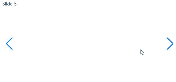
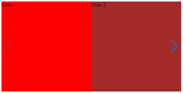
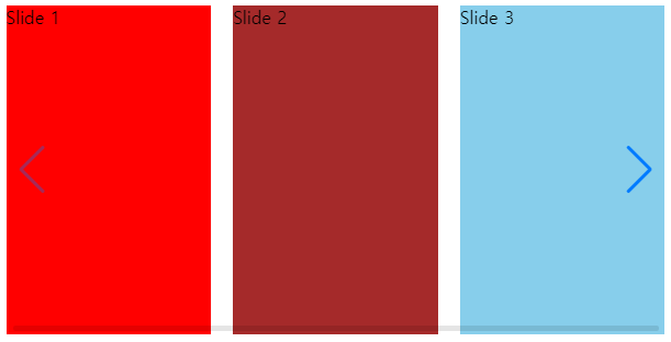
2단계: 기본 레이아웃 추가
<div class="swiper-container">
  <div class="swiper-wrapper">
    // 메인 슬라이드
    <div class="swiper-slide">Slide 1</div>
    <div class="swiper-slide">Slide 2</div>
    <div class="swiper-slide">Slide 3</div>
  </div>

  // 페이지네이션
  <div class="swiper-pagination"></div>

  // 슬라이드 좌,우 버튼
  <div class="swiper-button-prev"></div>
  <div class="swiper-button-next"></div>

  // 스크롤바
  <div class="swiper-scrollbar"></div>
</div>
swiper-container > swiper-wrapper > swiper-slide 순으로 감싸져있어야 하고,
swiper-slide가 슬라이드의 내용이 됩니다.
3단계: 스크립트로 Swiper 초기화
new Swiper('.swiper-container');
.swiper-container 클래스를 포함한 다른 레이아웃 클래스의 이름을 변경할 경우에는 css, js 파일에 있는 클래스 이름도 같이 변경해야 합니다.
슬라이드 옵션
Swiper에는 다양한 옵션들이 있습니다.
옵션을 사용하면 마우스로만 움직이는 슬라이드를 버튼 클릭으로 움직이게 하거나,
아무런 동작을 하지 않아도 자동으로 슬라이드가 넘어가게 하는 등 사용자가 더 편리하게 이용할 수 있습니다.
옵션 적용하는 방법
스크립트 파일에 넣는 코드입니다.
옵션이 필요없을 때
new Swiper('.swiper-container');
옵션을 적용해야 할 때
var mySwiper = new Swiper('.swiper-container', {

   // 여기에 옵션을 넣어야 합니다.

   // 예시 코드
  navigation: {
    nextEl: '.swiper-button-next',
    prevEl: '.swiper-button-prev'
  },

  autoplay: {
    delay: 3000
  }
});
자주 사용하는 Swiper API
예제처럼 필요한 옵션과 값을 적어주면 적용할 수 있습니다.
동작이 아닌 버튼이나 스크롤 바가 생기는 등의 옵션은 해당 html 코드도 같이 넣어주어야 합니다.
| 옵션 변수 | |||
| 예시 코드 | 코드 설명 | ||
| allowTouchMove: false | false값을 넣을 경우 슬라이드를 터치를 통해 직접 움직일 수 없습니다. slidePrev, slideNext와 같은 슬라이드 조작 버튼이나 autoplay와 같은 외부 요소를 통해서는 움직일 수 있습니다. |
||
| autoHeight: true | true로 설정하면 슬라이드 내용의 높이에 따라 자동으로 슬라이드의 높이를 조정합니다. | ||
| breakpoints (예시 코드 →) |
브라우저의 크기별로 반응형 설정을 할 수 있습니다. breakpoints: { // 브라우저 320px 크기일 경우 320: { slidesPerView: 3, spaceBetween: 20, }, // 브라우저 480px 크기일 경우 480: { slidesPerView: 3, spaceBetween: 30, }, // 브라우저 640px 크기일 경우 640: { slidesPerView: 4, spaceBetween: 40, } }, |
||
| direction: 'horizontal' direction: 'vertical' |
슬라이드의 진행 방향을 정합니다. horizontal = 가로(기본) | vertical = 세로 |
||
| effect: 'slide' |
'slide' | 'fade' | 'cube' | 'coverflow' | 'flip' 다섯 가지의 슬라이드 전환 효과를 부여할 수 있습니다. effect: 'slide' // 기본 슬라이드 전환 effect: 'fade' // 희미해지면서 슬라이드 전환 effect: 'cube' // 큐브 형태로 전환 effect: 'coverflow' // 약간의 그림자와 함께 슬라이드를 밀어내며 전환 effect: 'flip' // 카드를 뒤집듯이 전환 |
||
| enabled: false | 슬라이드의 활성화 여부를 정할 수 있습니다. false 값을 넣으면 슬라이드의 모든 요소가 비활성화됩니다. |
||
| followFinger: false | |||
| grabCursor: true |
데스크탑에서 슬라이드에 커서를 올렸을 때 그랩 커서를 보여줍니다.
|
||
| loop: true |
슬라이드를 계속 반복합니다.
[슬라이드 순서] false: slide 1 → slide 2 → slide 3 → end true: slide 1 → slide 2 → slide 3 → slide 1 → …… |
||
| on |
이벤트 핸들러를 등록할 때 사용합니다.
|
||
| slidesPerView: 1 | 슬라이드 표시 개수입니다. |
||
| spaceBetween: 0 | 슬라이드 간 거리를 조절합니다. (px 단위) |
||
| speed: 1000 | 슬라이드가 전환될 때의 시간을 지정합니다. (밀리초 단위, 1000 = 1초) | ||
| touchRatio: 1 | 터치 비율을 조정합니다. 숫자가 올라갈수록 슬라이드를 넘길 때 필요한 터치 동작이 줄어듭니다. |
||


스와이퍼 공식 홈페이지에는 나오지 않는 방법들
한 페이지에서 스와이퍼를 여러 번 사용해야 할 때 선언하는 방법
스와이퍼를 한 페이지에서 여러 번 사용할 때가 있습니다.
그럴 때는 swiper-container 클래스마다 추가로 클래스를 넣고, 각자의 클래스를 스크립트에 선언해주면 됩니다.
[HTML]
// 첫번째 슬라이드입니다.
<div class="swiper-container swiper1">
    <div class="swiper-wrapper">
        <div class="swiper-slide">Slide 1</div>
        <div class="swiper-slide">Slide 2</div>
        <div class="swiper-slide">Slide 3</div>
    </div>
</div>

// 두번째 슬라이드입니다.
<div class="swiper-container swiper2">
    <div class="swiper-wrapper">
        <div class="swiper-slide">Slide 1</div>
        <div class="swiper-slide">Slide 2</div>
        <div class="swiper-slide">Slide 3</div>
    </div>
</div>
[Javascript]
// 첫번째 슬라이드에 추가한 클래스를 선언해주세요.
var swiper1 = new Swiper('.swiper1', {

	// 옵션을 넣어주세요.
});

// 두번째 슬라이드에 추가한 클래스를 선언해주세요.
var swiper2 = new Swiper('.swiper2', {

	// 옵션을 넣어주세요.
});
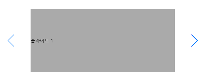
슬라이드 버튼을 swiper-container 밖으로 이동시키는 방법
작업을 하다보면 슬라이드의 버튼을 컨테이너 밖으로 이동시키고 싶은데 화면에서 사라질 때가 있습니다.
그 이유는 .swiper-container 안에 들어간 overflow:hidden 속성 때문인데요,
슬라이드를 사용하기 위해선 overflow 속성을 끌 수 없으니 이 방법을 사용하면 해결할 수 있습니다.
[HTML] - 기존
<div class="swiper-container">
    <div class="swiper-wrapper">
        <div class="swiper-slide">슬라이드 1</div>
        <div class="swiper-slide">슬라이드 2</div>
        <div class="swiper-slide">슬라이드 3</div>
    </div>

    <div class="swiper-button-prev"></div> <!-- 이전 페이지 -->
    <div class="swiper-button-next"></div> <!-- 다음 페이지 -->
</div>
[HTML] - 수정 후
<div> // 임의의 DIV
    <div class="swiper-container">
        <div class="swiper-wrapper">
            <div class="swiper-slide">슬라이드 1</div>
            <div class="swiper-slide">슬라이드 2</div>
            <div class="swiper-slide">슬라이드 3</div>
        </div>
    </div>

    <div class="swiper-button-prev"></div> <!-- 이전 페이지 -->
    <div class="swiper-button-next"></div> <!-- 다음 페이지 -->
</div>
기존에 .swiper-container 안에 있던 버튼 두 가지를 밖으로 빼내고 전체를 임의의 div를 새로 감싼 모습입니다.
그리고 이제 새로 감싼 div에 position:relative를 추가하고,
.swiper-container에 있던 position:relative를 position:static 으로 변경해주시면 됩니다.
[결과 화면]
스와이퍼 홈페이지에서 더 많은 옵션과 예제를 확인할 수 있습니다.
예제: https://swiperjs.com/demos/
감사합니다.
'javascript' 카테고리의 다른 글
| [TweenMaxㆍGSAP] 트윈맥스 제대로 배우기 - 기초1(GSAP 메서드) (0) | 2021.10.01 |
|---|---|
| [TweenMaxㆍGSAP] 트윈맥스 제대로 배우기1 - 입문(세팅방법) (0) | 2021.09.28 |
| 반응형 슬라이더 Swiper (사용 방법/예제) 웹퍼블리싱 (0) | 2020.02.17 |
| placeholder 제대로 사용하기 (2) | 2019.01.17 |
| jQuery란 무엇인가? jQuery 메서드 정리표 2편 (0) | 2018.11.13 |